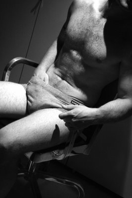
An out-take from my photo shoot with the very sweet and sexy Steve last night. Manipulated slightly (the image, not Steve) to darken it, add some 'noise' and deepen the contrast. I'm fairly pleased with the result, although I did get some better pics. I'm submitting one into a competition on Flickr, and once that has been judged I'll share that one here - my favourite pic from the night. I'll also post a few more from the evening on Flickr.
I like Steve's left hand in this pic, not the one going the grab but the one on the arm of the chair. I like the modelling of the shadows and the strong masculine look of the hand. If I took this again I'd change the pose slightly to get Steve to scooch his hips forward, taking a little of the slump out the posture and eliminating the crease mark across his belly, and I'd work on changing the shadows a bit too. Still, for a first attempt at this sort of photography I'm pretty happy with some of the results, and as I said I'll share a few better pics once the competition closes (at the end of the month).

10 comments:
Hah! I was all like "Gotta go sweetie! Got a date with a semi-naked man!" :)
Thanks for the positive feedback. Sure, I'd love to take your pic some time, pretty lady!
Nice work upping the contrast in "post production". Looks better than the original.
Moodier, I think. Suits the topic, and given the low light levels we were working with the enhanced contrast works well. Plus I like the grainier look.
What a lovely photo. I agree with Q-60's girl about the anticipation of the shift in the seat to a more 'comfy' position.
Keep up the good work!
I think the pose differences you're suggesting aren't strictly neccessary considering the mood you're trying to find. to change it to look more perfect (ie, getting rid of the wrinkle across the belly) would only be right if you were going for prefection, in which case, you'd be ditching the knickers and going full nude, having the body oiled and/or waxed, etc. in doing that, you strip a lot of character from the body.
btw the hand really is lovely, more time considering lighting will reap rewards (I should talk, lighting can be my real weak point).
go with the imperfections - that's where real mood and beauty and the truly interesting images are. anyone can oil a body and do soft porn - which is not a comment of your work, TOA, unless of course you *want* to do soft porn ;)
Nicely done Andrew... I definitely see what you mean about the arm closest to the camera, it really pops...
There are a few things I would have done differently had it been me, but I've gotten in trouble for offering unsolicited photographic advice before, so I'll hold my tongue... plus, as you said it's your first attempt at this sort of thing, and a very good one at that.
:)
Jodie, Speedy & Yani, thanks for the comments and feedback. I like the picture as it stands, but it's good to be able to look at it and think "ah, next time I'd do tis or that" - all part of the artistic process and growth. Yani, I don't mind hearing your suggestions if you care to share. I know they're aimed at being constructive.
PS. How about that sexy chrome office chair by Phillipe Starck - I mean that's sexy in and of itself, non? :)
yeah, I had a little bit of an admire at the chair... it's a bit lickygorge!
I shoulda written them down when I thought of them originally, because I can only remember one now... lol...
And that was just that in B&W photography grey underwear (at least I'm assuming it was grey marle) isn't always the best choice... especially when you're model's skin tone and the lighting are very close to that kind of colour. I always prefer something either black or white... and I tend to go with whatever will set the model's skin off the most (black underwear on a pale model will usually make them look paler, and white underwear on a tan model will make them look even tanner)...
And while we're on the underwear, something that I usually end up kicking myself about later... beware of the obvious underwear label... any time you have text in a body shot like this, the eye is going to pop to it (as I can attest from the 1001 camera club judges who have said the same thing about various shots of mine)... but generally it's nothing that the clone feature in Photoshop can't fix.
Other than that, its pretty much all good...
Post a Comment