I'm exhibiting in a group photo show in about 3 week's time and I'm stuck on which pic to show. The theme of the show is RGB - Red Green Blue. I chose Green. As I have
commitment issuesI'm now all indecisive about which green pic...
Which of these do you love more, or hate less?
A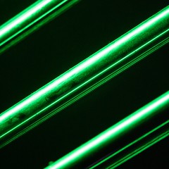 B
B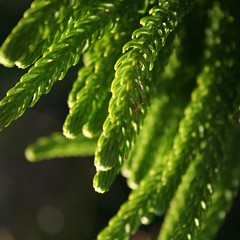

19 comments:
I like both, but my choice is A
I like B because it's natural. :)
I'll choose B. The green is more dominant compare to the A.
My first reaction was A, because it was severe and imposing, with its facist lines. But the texture of B grew on me, an I can appreciate the fractalness of organic material, so I pick B.
I'd hang A in my bedroom. I'd hang a bulb and some tinsel on B.
I say that with love.
I love B, but in the context of something dramatic for the show I think I'm leaning more towards A now. It's unusally abstract for me, but it's very dramatic. I'm really proud of B though.
Definitely B... you have good lighting, strong texture, sharp focus on the detail.
A is okay, but there's nothing that breaks up the pattern, plus your highlights are a little blown, and the rod closest to the camera seems softly focused, which bugs me.
God... I've turned into a Camera Club judge... please shoot me now...
Michael, ouch. Said with tough love, no doubt.
Yani, actually it's partly issues with focus that make B a problem for me. The area of focus is right up at the top of the picture, the remainder is very soft because the DOF is so shallow. In high res a lot of the pic is out of focus. In high res the central rail of the first pic A is much clearer than any of the focus in B. Yeah the highlights are a little blown, but I think it looks ok. I'm less about technical issues and more about composition and wow factor in general. I really like B, but I think A will maybe make more of a statement. I dunno, all feedback is appreciated.
You asked! I don't know jack about photography except I know what I like. Love the first one.
Mike, I was digging you about your tough love comments in the past. :) And anyway, B is kind festive... maybe I'll make it my Chrissmukah Card this year. Come stand under it, and you can kiss me under the balls.
What the fuck!? It's "B" all the way. What the hell is "A" but a green metal alien anal probe wand? (been there; don't ask...)
"B" however has color and texture and tone. And have you looked at "B" upside down?
:: everyone now standing on head ::
"A" just leaves me cold. Can't you all see the cold existential message of man's futility for truth as contrasted by Kierkegaard's conquest for humanity? It's so evident in the brutality of imagery; it rips my eyeballs from their sockets in it's sharp iconography. But I digress. And I'm hammered.
green metal alien anal probe wand
the cold existential message of man's futility for truth as contrasted by Kierkegaard's conquest for humanity
it rips my eyeballs from their sockets in it's sharp iconography
Exactly. A.
It's so visceral around here all of a sudden...
I'm indecisive. But I'm going for A. I think.
I'm a fan of B
A looks like wrapping paper.kovirgw
Definitely A.
I'm sure your print will be surround by pics of flora and fauna.
Make yours stand out.
(Your Name Is) Earl, that's sort of what I'm thinking. Plants = green is a bit predictable. Picture A, which is a bowling ball storage rack lit by green coloured fluorescent lights (believe it or not), is a bit more unexpected. Both pics have zero retouching, just cropped square.
it's a shame you couldn't make a dyptich with the red version of A. I'm presuming that all the green things will go together and all the red go together etc? bum. tiches are gooood.
go A. as you say, plants are that bit more predictable, and the focus is more obviously a bit off-centre.
most people enjoy trying to work out images - A has a little mystery to it!
Post a Comment