
The title sequence letters.
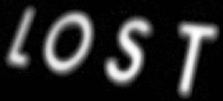
"Lost" opening title
I quite like the style of it, and I get what they are going for, but the spacing of the letters bothers me. "Er, what?", you say. You see I love typography, and I'm a bit of a font nerd. In the world of typography there is a thing called kerning, which is basically to do with the spacing between letters, and manually adjusting it so that the visual impression is of equal space between the letters. You basically tuck some letters in closer together because the shape of the letters makes them look further apart. See above how the S & T seem further apart?
Ok, I understand that there is also foreshortening involved in this case, that they may be trying to emphasise the angle of the letters receding into the distance. It still looks off to me, the angle is not that strong that after all.
Anyway, I'm aware that I'm possibly the only person bugged by this. So, as you were.
4 comments:
Kerning, huh? Thanks for that word Andrew.
Next time I am travelling on Shitty Snail, oops, I mean City Rail, travelling in the long seats immediately next to the entry area only to find inconsiderate people unevenly spaced and not allowing other room to sit I will give them my best self-rightouss stare and announce (in my best City Rail announcers voice complete with bad static, drop-outs and indistinguishable accent) "will seated passengers travelling near the vestibule area please consider kerning for the benefit of other passengers".
Bodhi :-)
Sydney, Australia
Yes, but that'll only work if the passenger in question id Mr T.
Baddumm-bumm, tish!
It's my screen background now, ill kerning be damned.
And "emphasise"? Tease.
You just love the Queen's English, don't you big boy?
COLOUR, FLAVOUR, EMPHASISE, ORGANISE!!...
Post a Comment